My role: Lead Visual Designer
Who I Worked With: Creative Director, Account Manager, Senior Management, Programming and Copywriter
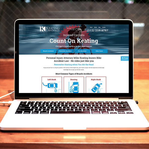
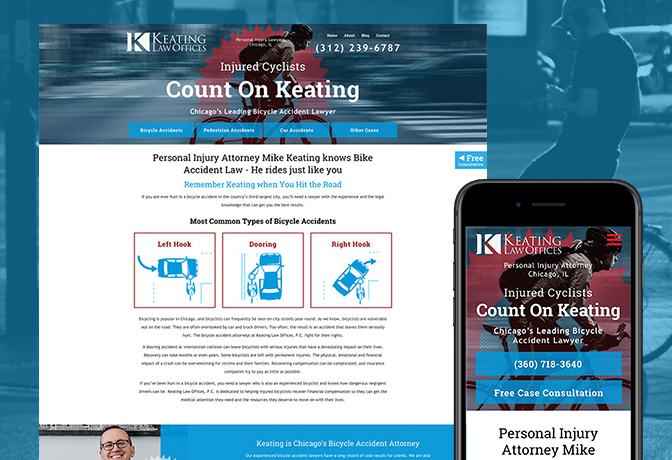
Project Summary: Our task was to redesign a website for an established Chicago attorney that was focused on bicycle accident law. The client was an avid cyclist with extensive knowledge and experience. The client’s practice areas included, primarily bicycle accidents (accident types/cases: dooring, intersection, right hook, left hook), pedestrian/jogger accidents, car accidents, ride share and taxi accidents.
The challenge: The challenge was to represent the client as an expert in the area of bicycle accidents and bicycle law. We wanted to appeal to cyclists that have been injured by negligent motorists in the Chicago area. It was mandatory that we keep the existing logo, but can use green or consider leveraging blue as referenced in the Chicago Bike flag.
Solution: The team originally explored using the color green as a brand color for the site because this was the color used on the client’s original website and was featured in the clients’ logo. However, the team eventually settled on using the blue color used in the Chicago Bike Flag.
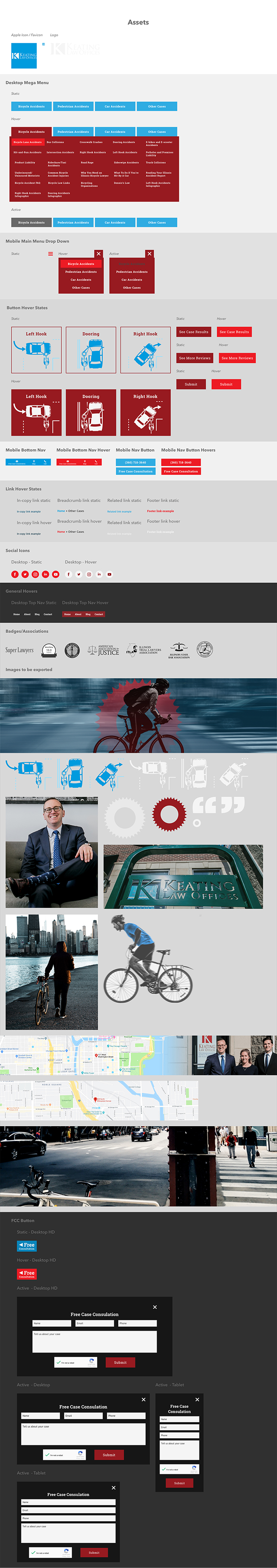
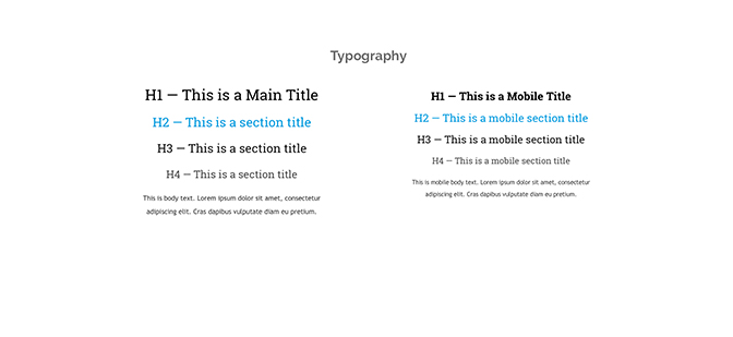
As part of each website we design, it is standard practice for us to develop a design system to facilitate the templated process we use for content. In order to build authority for our clients and optimize the sites we design for search engines, we produce keyword-rich content surrounding the client’s practice areas. In order to reduce turn-around time and ensure a smooth process for our content management team, we develop a strong typography system and interior page layout which can accommodate any web content.
Tools used: Sketch, Adobe Photoshop, Adobe Illustrator, Zeplin
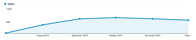
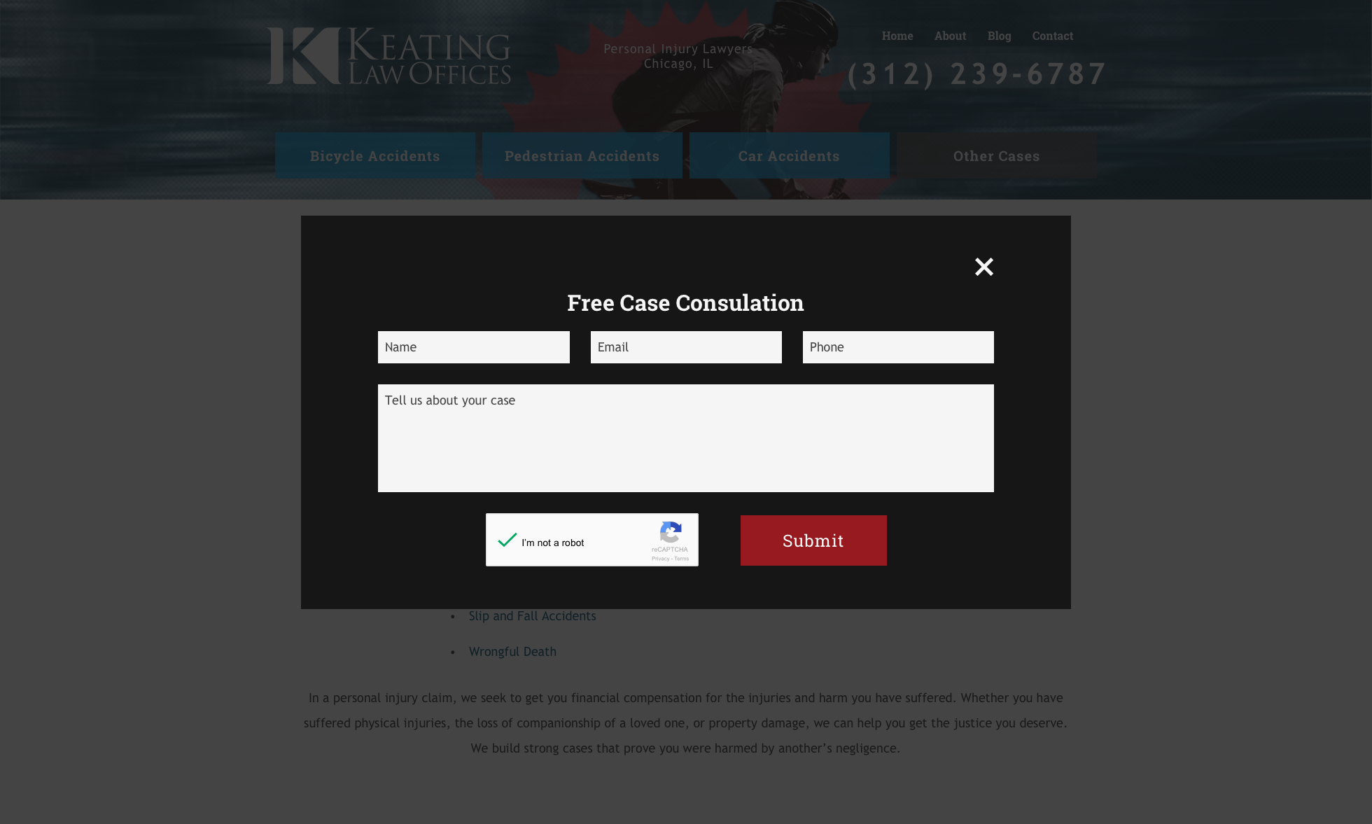
Results: Client was satisfied with the design and saw an overall increasing trend of traffic to the site over the next few months. One of my favorite parts about designing this site was that the client had great photography to work with. It was a pleasure to design this site and find ways to integrate photos of the client alongside images of cycling. This was one of the first few sites that we began experimenting with using a fixed bug that would launch a pop-up contact form in a modal window instead of a traditional contact form. We decided to use this strategy in order to draw the users focus to the content with little distraction, but still allow the user easy access to reach out to our client.