
My Role: UX Designer/Web Developer
Who I Worked With: Direct Report and Company Stakeholders
Project Summary: Worked with program leads to convert existing web pages developed in Adobe Muse
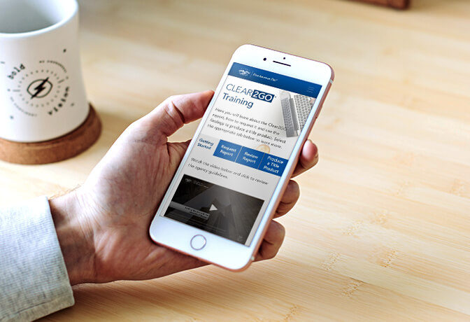
Project Brief: This client had already established webpages used for training new and existing users on software titles from different vendors. However, because these pages were created using Muse, and Adobe was ending support of this product, these pages were flagged by the organization’s information security team as a potential risk. The client sought some way to keep this information available to users who need it, as well as make some improvements and modernize the pages.
Challenge: The challenge was that many of these existing sites were out-of-date, not mobile-responsive, and/or had poor user experience. Another problem was that there weren’t detailed metrics of how users were interacting with the site. Google Analytics was implemented on many of the sites but didn’t have granular details about what users were clicking on to understand what should be prioritized.
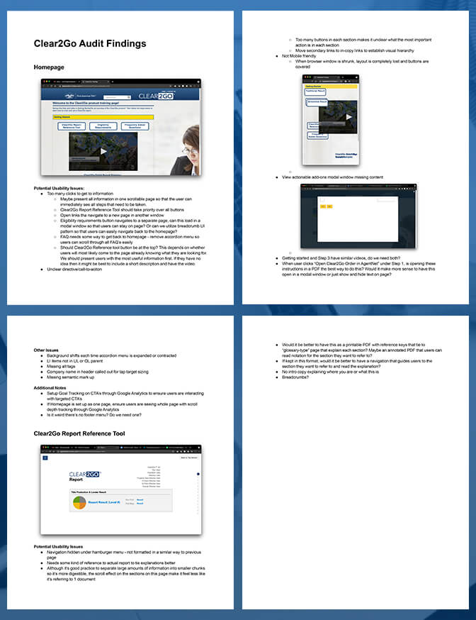
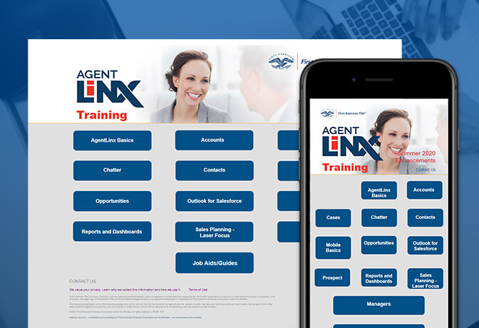
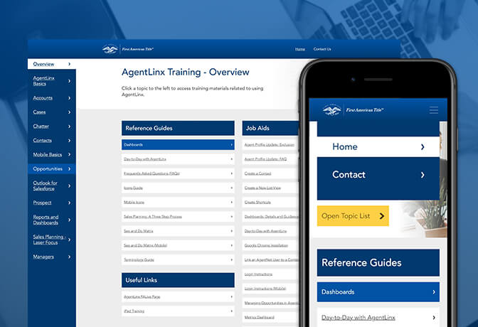
Solution: Following an in-depth usability audit, the first issue we wanted to address was the poor user experience. One of the factors contributing to this problem was the fact that each site looked totally different and each followed a different design pattern for users to navigate. In order to help users complete tasks we designed a more consistent layout that users would immediately comprehend.
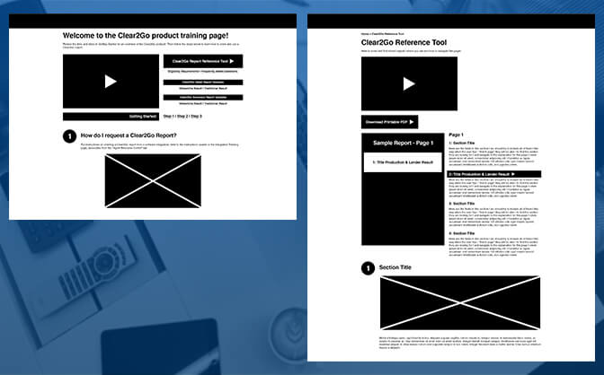
I put together a few different wireframe options to review with organizational subject-matter experts. Together, we decided on a tabbed layout for the sites so that users could browse training materials in a straight-forward format. This was the right choice because this is a design pattern used on other company pages. The internal stakeholders we worked with confirmed that users were accustomed to digesting training materials in PDF format to guide them through tasks and this would be an acceptable to the user-base.
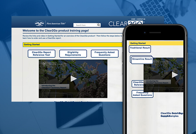
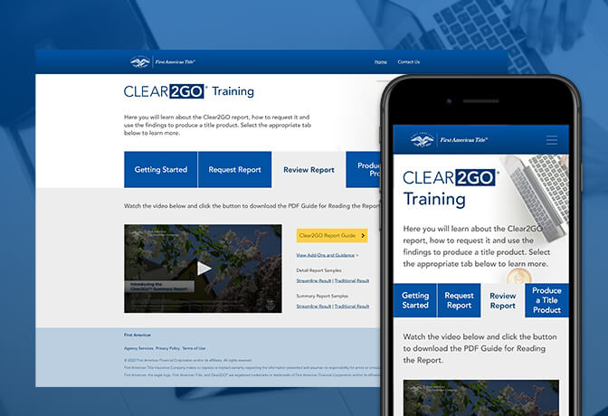
The initial attempt to implement this solution was to design the page in Adobe XD and then export it using the plugin Anima, this proved to be problematic though because we were not satisfied with the clunky and messy prototypes that it created. So, we decided that I would code the sites using Adobe Dreamweaver and implement a Bootstrap framework. By doing this, we were able to produce templated replacement web pages that were easier to digest, responsive (because we saw that a percentage of users were accessing materials via mobile devices) and more user-friendly than their predecessors with large, clearly labeled buttons and tabs for a more comprehensible navigation. Following the completion of site builds, stakeholder and user reviews, we implemented event tracking via Google Tag Manager to gain more finite details on how users were interacting with the redesigned sites.
Result: Both internal stakeholders and users were pleased with the newly redesigned sites. We had put together a number of different design systems using different, but similar design patterns to allow users to intuitively recognize navigational structure no matter which site they were on. Management was also satisfied with the new data metrics that they were starting to see so that they can make more informed decisions going forward. I again learned the importance of flexibility through this process. The original plan was to build all sites using Anima, but the HTML files the plugin produced were messy and buggy. Given that we were under strict time constraints, there was no time to test and build a process for a new solution. This was also my first time building a site from scratch using Bootstrap and I had a chance to explore some of the features and adaptability this framework allows for.